After hoping for months that a wonderful WordPress theme would simply fall into my lap and I’d adopt it for my blog, I took charge of the situation three days ago and went on a mission to install all the Magazine themes I could access from my site’s WordPress dashboard. Magazine…because I’d decided that my blog would benefit from a ‘feature post’ whose display I would control and not the chrono order of a general blog theme. All the themes were free but some had their paid version for added functionality.
It was gratifying to be able to activate several themes and see my posts simply flowing into them. WordPress is totally beautiful to offer that instant gratification. Then again, it wasn’t so great when I couldn’t remove several unwanted elements from the new themes or enforce a preferred layout. Most Magazine themes appear busy and show much action. I didn’t want to give a false impression of writing a highly active blog and not living up to it. I did want a new interface though and was convinced that it had to be a magazine theme that would display my categories much like a regular site’s navigation bar.
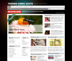
Among those I tried, it’s ironic that I should settle for a theme by a company identifying itself as Antisocial Media when a blog actually promotes social networking. Well, I did install the  available theme (screenshot on the right) and wondered for a bit if I could live with it. It had a sliding feature section that moved continuously, showing the first 5 posts of the featured category, and a ‘feature’ ribbon on a side that looked somewhat undesirable. It also had in-built widgets appearing all over. I wished for those days of drawing out interfaces in Fireworks when I could stamp out or highlight elements at whim, and present an image map of a drawn up theme to a client for approval. Some of you know that I designed a few sites in pure HTML days and later even graduated to showing javascript based elements like drop down menus, hover or image maps using a combination of Fireworks and Dreamweaver from the Macromedia suite. Soon people had started asking for too many dynamic and e-commerce features so I bowed out of active designing. That stint helped me play with Fireworks, Photoshop and Corel Draw, which I’d enjoyed learning. My regret is that I didn’t get around to figuring CSS which I really wish I had when I’d a designing student’s hat on — for all blog themes now require tweaking of style sheets.
In that sense though, this chosen theme was lovely as it had many CSS features available as theme options and I could alter them from its multiple menus. But even after I was done customizing the design through menus, it had much I wanted differently. Later, when Kishore saw the theme’s options, as always, he saw more than I did and found easy ways to vary the placement of some widgets by going into the theme’s tutorial mode. Importantly, he made changes through the theme’s given options without opening the theme style sheets. He brought in some outside plug-ins that made the blog more social than my earlier one, and I was glad to see the final design belying its company’s name in some manner. I was, and am, grateful to them, however, for allowing CSS control through theme options.
I finished the design by softening the navigation bar with dots, changing some colours, removing the background jpg and adding an image as the blog’s title. The end result is something I can live with for at least some time to come. And, this is even when the reworked interface doesn’t carry a ‘feature section’. For now, I’d make some posts sticky if I want a higher visibility for them, and the new category navigation bar will help visitors reach subjects of their choice.
If you’re an old-timer, do post your feedback on the new look and feel.
were you able to figure out how to remove that unattractive “ribbon” in the slideshow section?
LikeLike
Una, With the changes to style sheets working from the given theme options, I didn’t download the theme style sheets and images. Also, the magazine format made the layout too busy for my kind of blog. Otherwise, I’d have looked for the ribbon image in image folders and deleted it. There was no ready option to do so.
LikeLike